


ROLE
UX DESIGNER
UX RESEARCHER
DEVELOPER
TIMELINE
FALL 2025
8 WEEKS
TOOLS
FIGMA
FIGJAM
FLASK + PYTHON
HTML/CSS
01 WHAT IS FLICKPICK?
CONTEXT
Choosing a movie often feels more frustrating than enjoyable, especially in group settings. Endless scrolling and debate make it difficult to agree on a single option, leading to decision fatigue before movie night even begins.
FlickPick is a mobile app designed to make choosing what to watch feel easier and more fun. Instead of browsing long lists, users decide through a structured, tournament style flow that works both solo and with friends, balancing playful interaction with practical tools for discovery and reflection.
CHALLENGE
→
Design a digital product that helps users confidently choose a movie without overwhelming them with options.
SOLUTION
→
Decision making, made fun
FlickPick is a movie discovery app that turns choosing what to watch into a bracket style experience. By guiding users through simple, head to head comparisons, FlickPick narrows options step by step and helps users reach a clear, confident decision.
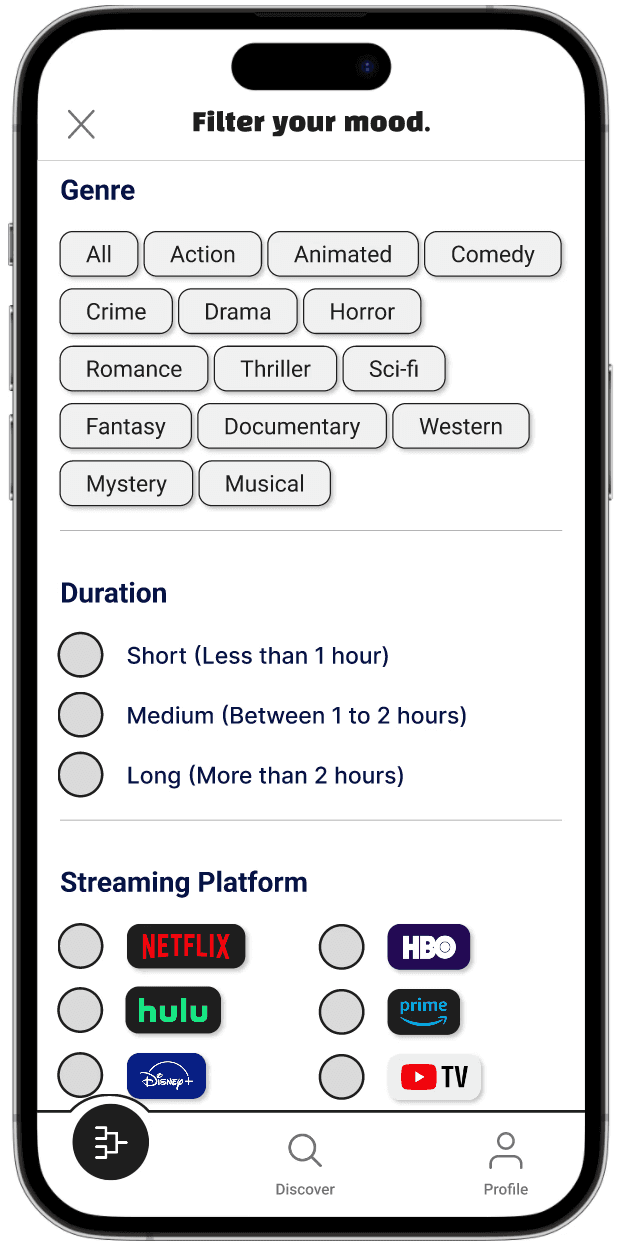
Filter for your mood

Two choices at a time

A clear decision
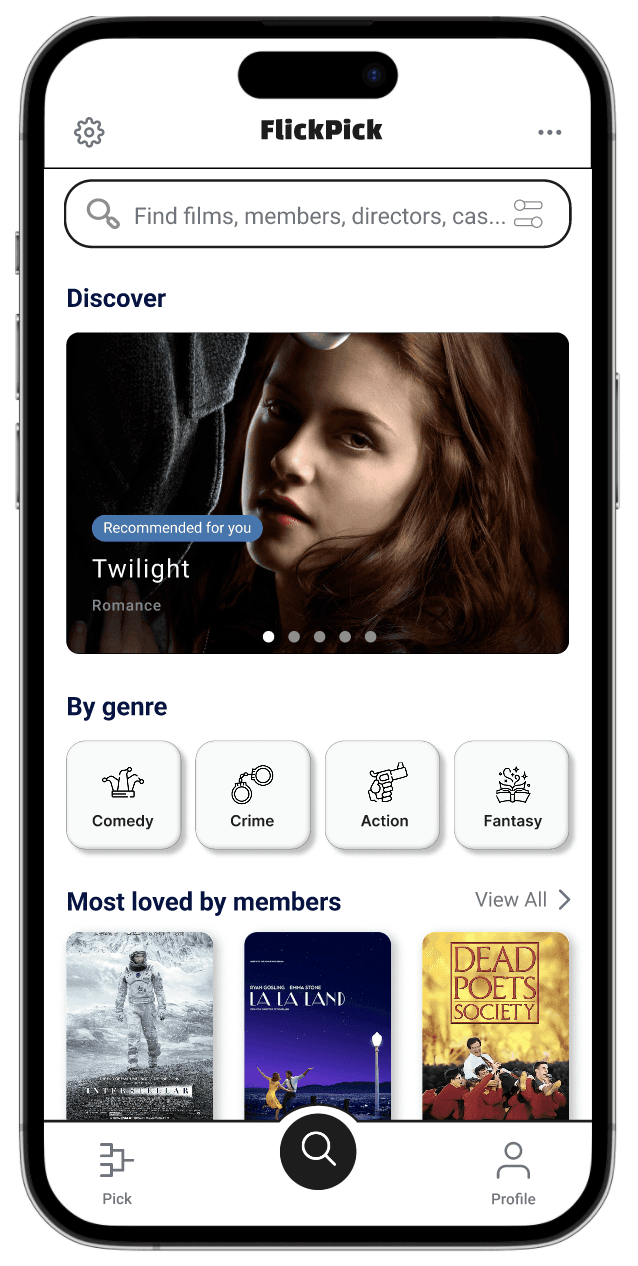
Browse without pressure
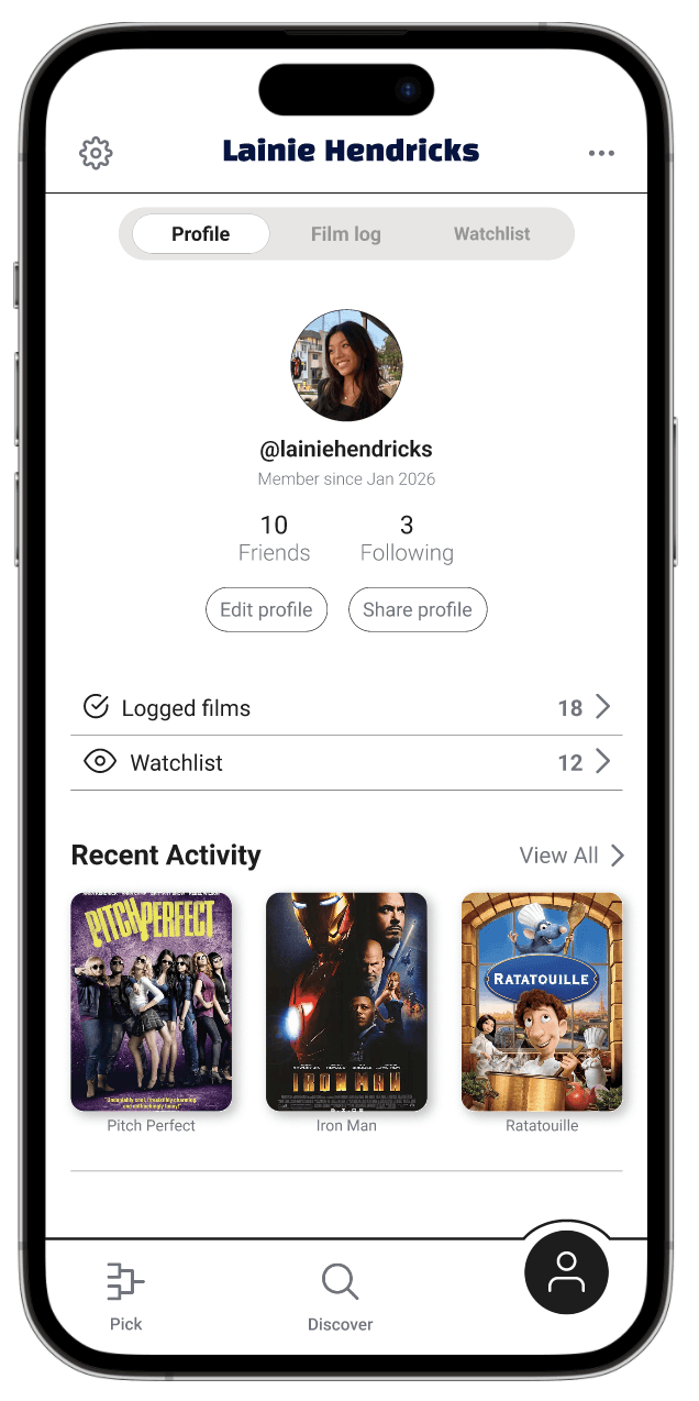
Your taste at a glance

Track what you’ve watched and what’s next
02 RESEARCH
INTERVIEWS
I conducted three interviews to understand how people choose movies alone and in group settings.

Affinity diagram showing common pain points across interviews.
COMPETITIVE ANALYSIS
I analyzed common movie discovery and streaming platforms to understand how existing products support movie selection and where they fall short in helping users decide.

Diagram showing the pros and cons of existing movie discovery platforms.
INSIGHT
→
Choosing a movie is about decision-making, not discovery
CHALLENGES
→
Reduce decision fatigue from large content libraries
→
Support faster, less frustrating group decisions
→
Reinforcing confidence once a choice is made to avoid rebrowsing
DESIGN QUESTION
How might we reduce choice overload and support confident movie decisions, both for individuals and groups?
03 IDEATION
OPTION 1: HEAD TO HEAD COMPARISON BRACKETS

Movies are presented in head to head comparisons. Each choice narrows the pool until a single winner remains.
Pros:
→
Reduces cognitive load
→
Creates momentum toward a clear end point
→
Can work for both solo and group decision making
OPTION 2: RANDOMIZED WHEEL PICKER
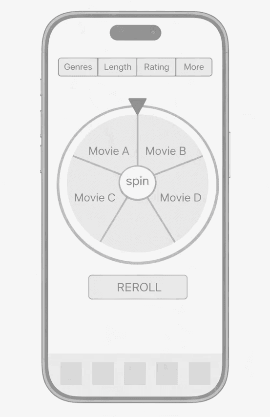
A randomized wheel selects a movie from a filtered set. Users can re-spin if the result doesn’t feel right.
Pros:
→
Feels playful and low effort
→
Removes pressure from choosing
Cons:
→
Less user control
→
Weaker confidence in the final result
OPTION 3: RATING SYSTEM

Users rate multiple movies, and results are aggregated to surface a top option.
Pros:
→
Allows individual preference expression
→
Democratic in groups
Cons:
→
Requires evaluating multiple options
→
Difficult for movies that users haven't seen
SELECTED CONCEPT
→
Bracket Style Matchups
The bracket style approach balanced structure and agency, helping users stay involved while still reaching a clear, confident decision.
04 THE DESIGN
INFORMATION ARCHITECTURE
This structure separates decision making (Pick), exploration (Discover), and reflection (Profile) to support different purposes.

TOURNAMENT FLOW
Multiple flow structures were explored to prioritize clarity, especially for group decision-making. The final flow guides users from setup to filters to matchups and ends with a clear winner.

KEY DESIGN DECISIONS
01 Minimal collaboration
→
Social features were intentionally scoped back to prioritize the tournament flow.
02 Separate decision making from browsing
→
Pick and Discover are intentionally distinct modes to prevent endless scrolling once users have committed to choosing.
03 Delay information until after a choice
→
Detailed synopses and metadata are minimized during matchups to avoid over analysis.
04 Filter once, decide many times
→
Filters are applied upfront instead of between rounds to reduce cognitive overhead and keep the tournament focused.
DIGITAL WIREFRAMES


MOCKUPS
Designs emphasize hierarchy and clear calls to action. Visual noise was minimized to keep focus on the decision itself.


05 OUTCOME
The final design supports end-to-end movie selection across solo and group contexts, emphasizing clarity, momentum, and confidence.
SOLO TOURNAMENT FLOW
FRIENDS CREATE GAME FLOW
PROFILE + DISCOVER FLOW
06 REFLECTION
TAKEAWAYS
→
Focusing on structure early made it easier to design the rest of the experience without overthinking individual screens or interactions
→
Separating the application into exploration, decision making, and profile helped keep the interactions focused and purposeful
WHAT I WOULD DO WITH MORE TIME
→
Design the full social flow, including adding friends, accepting requests, and deciding how friends appear across Profile, Pick, and Discover
→
Explore additional collaborative picking methods such as shared watchlists
→
Validate how different group dynamics (similar taste vs mixed taste) affect the tournament flow and final decision confidence
→
Conduct additional usability testing to assess the clarity of the tournament flow and app UX