
Seattle Urban Farm Co.
Building a cohesive brand identity and digital presence for a local urban farming business.
Timeline
Spring 2026
Client
Seattle Urban Farm Co.
Role
Brand Designer
Teammates
Shay Okita
Overview.
Context
Seattle Urban Farm Co. is a local business dedicated to making urban farming more accessible through education, workshops, and thoughtfully curated products.
The goal was to create a cohesive brand identity that reflected the company's mission while extending seamlessly across digital and physical touchpoints.
The Problem
The existing brand lacked a consistent visual identity, making it difficult to communicate its values and stand out across marketing materials.
The Opportunity
How might we create a brand identity that feels approachable, sustainable, and rooted in community?
The outcome
A complete visual identity system including a logo, color palette, typography, website, and product packaging.


Research.
What can we learn from existing brands?

Practical gardening resources with a utility-first identity.

Educational content paired with a modern retail experience.

Community-focused nonprofit centered on gardening education.
While competitors established trust through education and utility, few differentiated themselves through a strong, memorable visual identity.
Three key insights
that shaped every design decision that followed.
Community
Successful brands built trust by educating and engaging their local communities—not just selling products.
Our strategy
Position Seattle Urban Farm Co. as a community-first brand.
Sustainability
Natural colors, organic textures, and restrained visuals consistently reinforced environmental values.
Our strategy
Build a visual identity inspired by nature.
Simplicity
Clean layouts and minimal branding made products feel more approachable, premium, and memorable.
Our strategy
Prioritize clarity over decorative elements.
Ideation.
Guided by my research, I explored multiple logo concepts, color palettes, typography pairings, and visual styles before refining the final identity. My goal was to create a brand that felt approachable, sustainable, and rooted in community.
Mood boards

Logos

Wordmarks

Design.
The final identity

Logo
Designed a versatile logo system that remains recognizable across packaging, print, and digital applications while reflecting the brand's connection to urban agriculture.
Color Palette
Developed a palette of natural greens and warm neutrals to reinforce sustainability while creating a welcoming, approachable aesthetic.


Typography
Paired a classic serif with a clean sans serif to balance warmth, credibility, and readability across every brand touchpoint.
Wordmark
The wordmark uses clean typography to create a modern feel. Its simplicity improves readability while reinforcing the brand’s refined identity.

Applying the brand

Website
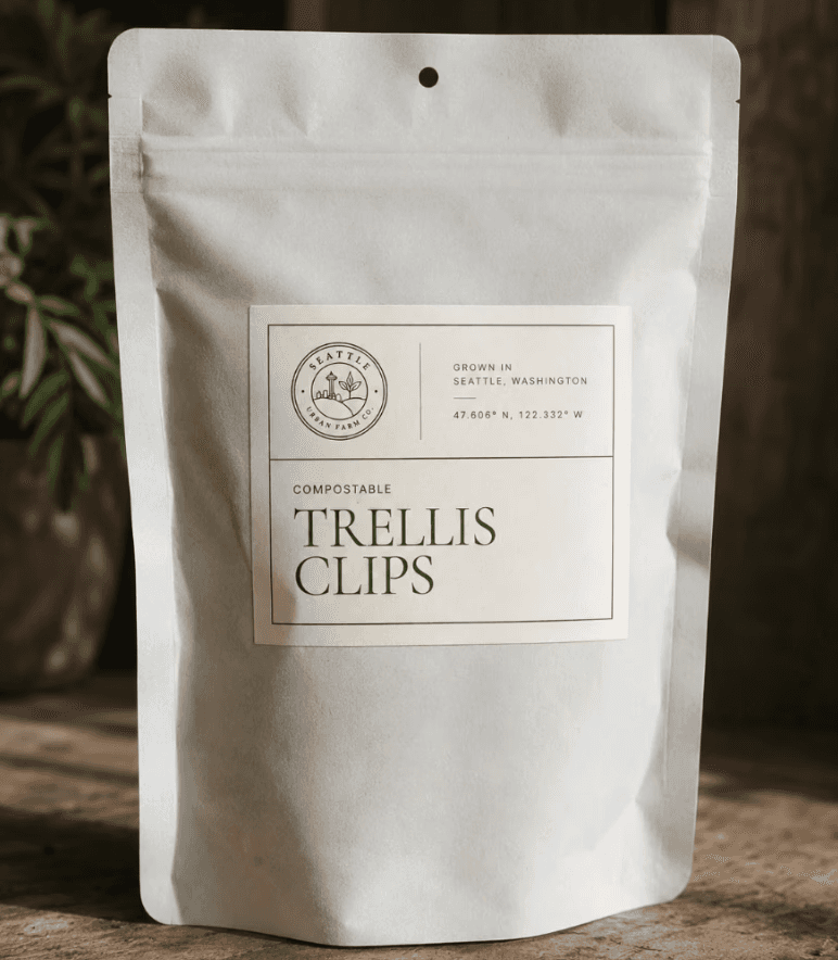
Extended the identity across packaging to create a recognizable and consistent product experience.
Packaging
Extended the identity across packaging to create a recognizable and consistent product experience.
Final Product.
The final brand system applied across digital and physical experiences.

Reflection.
Designing a cohesive brand system
Creating a brand extends far beyond designing a logo. This project taught me how every visual decision contributes to recognition, trust, and consistency.
Balancing flexibility and consistency
Designing across web, packaging, and print reinforced the importance of building a system that remains cohesive while adapting to different mediums.
Looking ahead
If I revisited this project, I would conduct user research with local gardeners earlier in the branding process, expand the identity system across additional touchpoints, and continue refining accessibility through typography and color contrast.


Have a project in mind?
We’d love to hear from you — whether you have a project in mind, or just want to say hi.